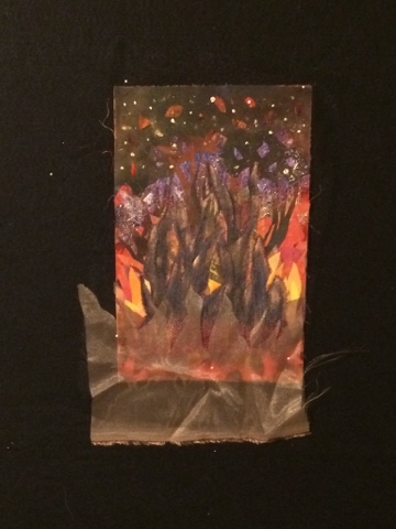
In the second lesson, she has us investigating 'fire', as in forest fire. This is where I'd really like to hear from you!
A week ago my piece was at this point and I liked it.
I had more to do, and I did! But it got to this spot, and I didn't like it.
I thought I might just 'set it on fire' ! I had lost all the work that was behind these trees and it is beginning to get rather "thick". So, out came my scissors. I trimmed out that red overlay from between the trees and even though I was happier, I knew it would need a final overlay and 'maybe' some filmy stuff across the bottom. The next three pictures are my options at present. Please disregard the excesses that extend below the piece. Things are not trimmed to size yet!
Number 1: golden under lay piece and black tulle over
Number 2: a dusty mauve underlay and black tulle over
Any suggestions?
Leave a comment to be entered into the drawing for some hand dyed fabrics, similar to these,
Or these,


6 comments:
Hi Luann, I prefer no. 1 with the glow coming right to the bottom of the piece. PosyP
I like #1 - it glows!!!
While I like #1 I think I would use #3 that looks like burning embers. The gold behind adds depth to the piece. Susan
I like the third one. I like that you have changed it. ritzy
The brighter yellow on the #1 pulls my eye away towards the bottom too much. #2 feels too dark. I really like #3 though - the dimension looks great, and the colors of the base of the fire truly do glow. -jdeluka
I want to thank you all for letting me know what 'spoke' to you.
Only a few more hours and the giveaway will be decided,,,
Luann
Post a Comment